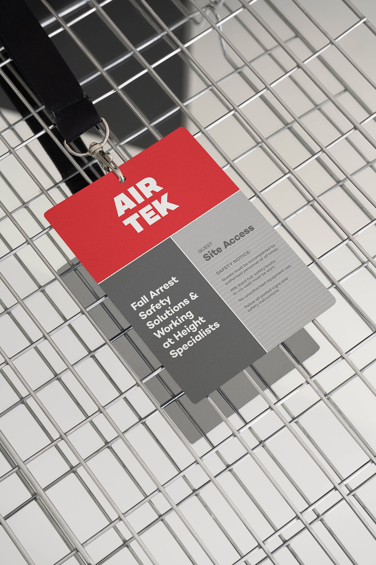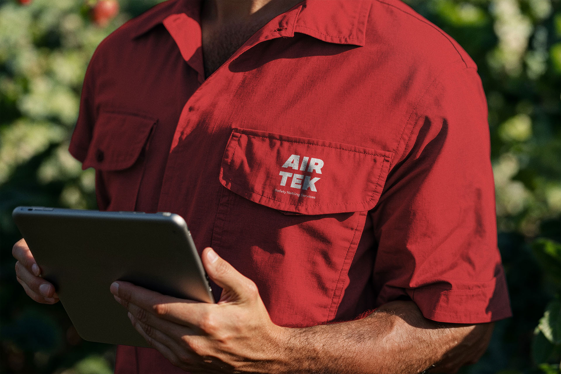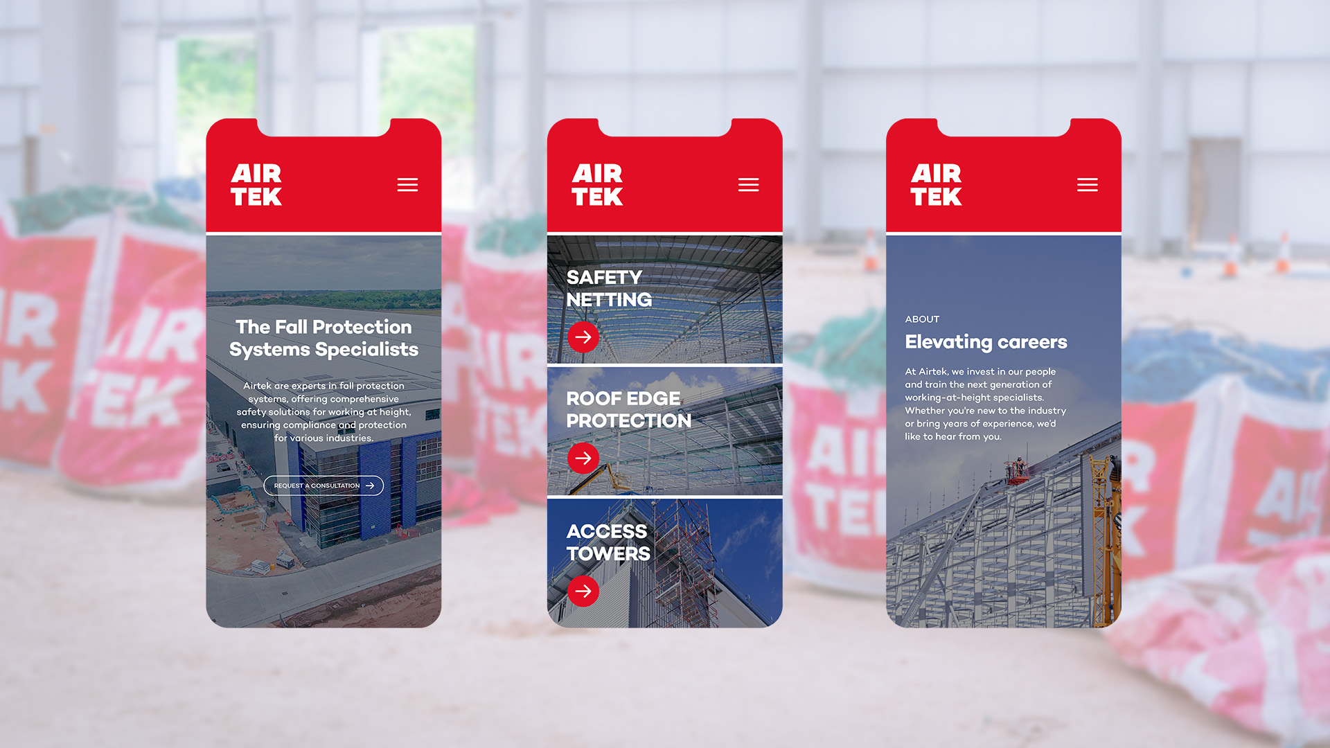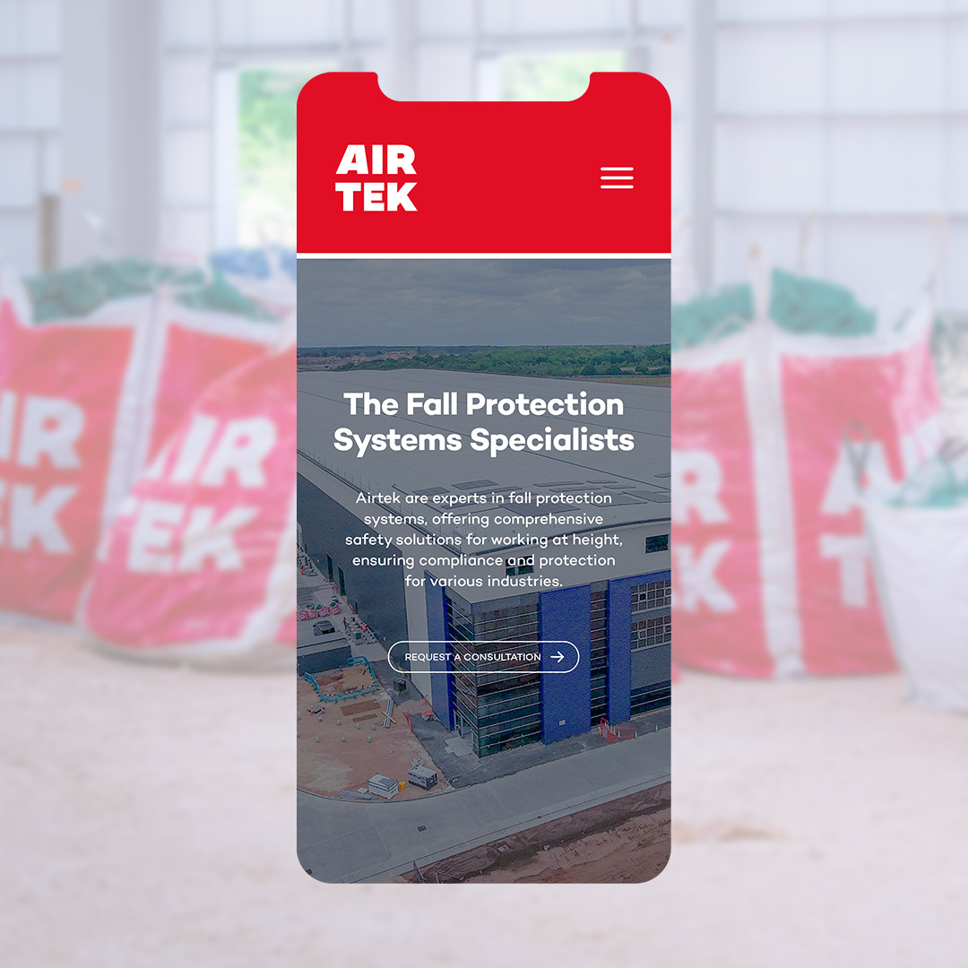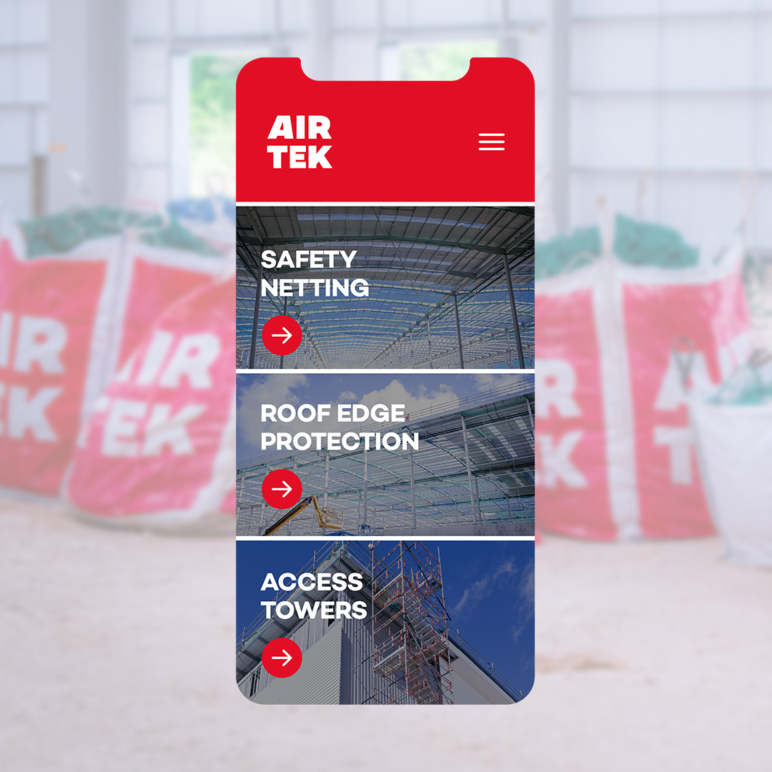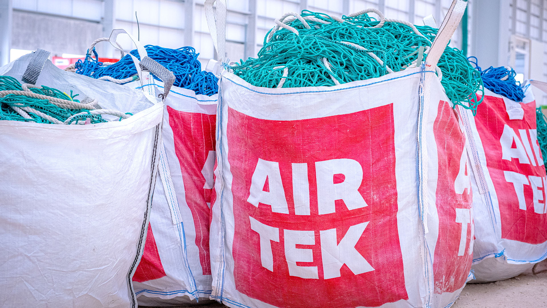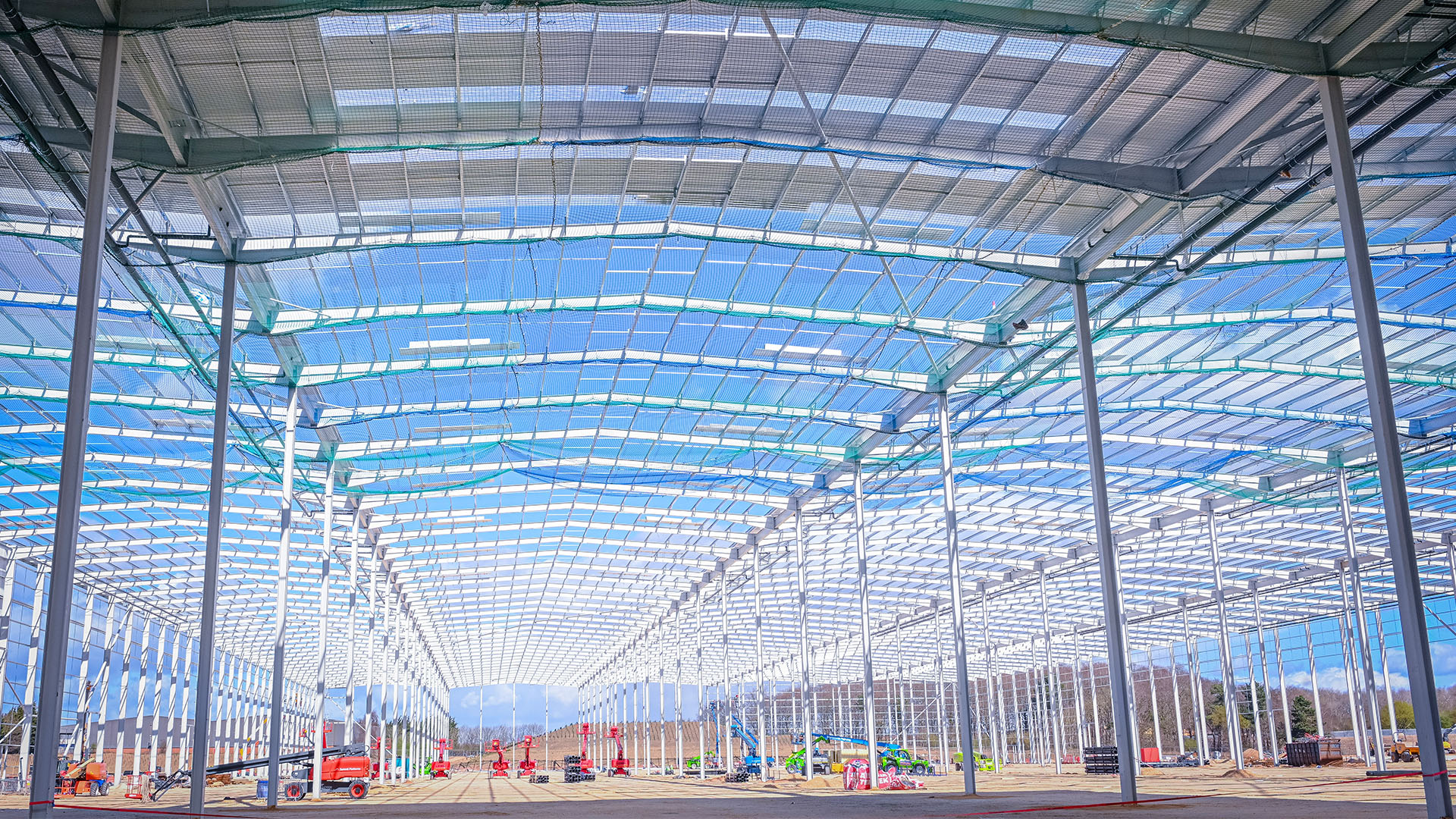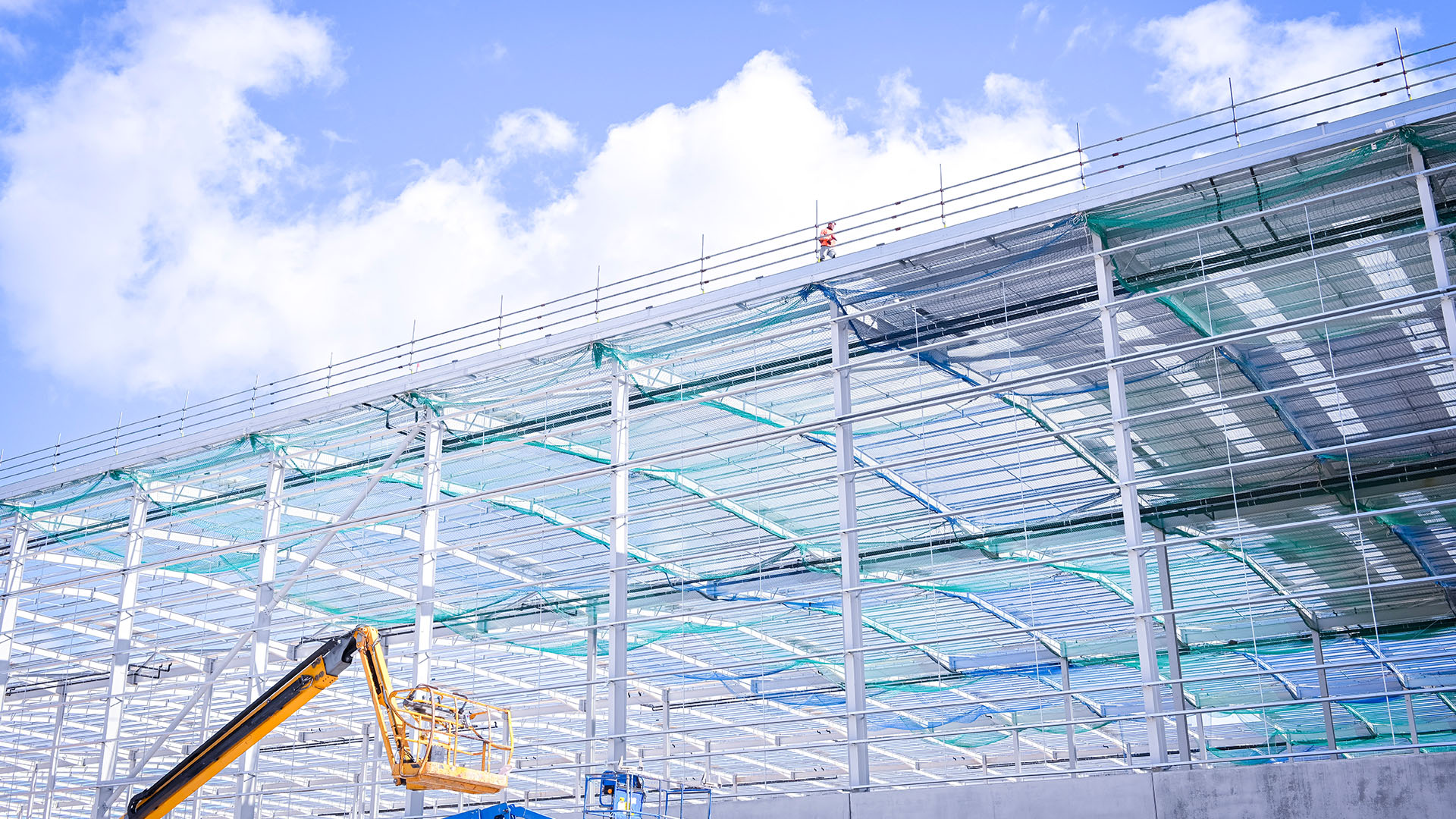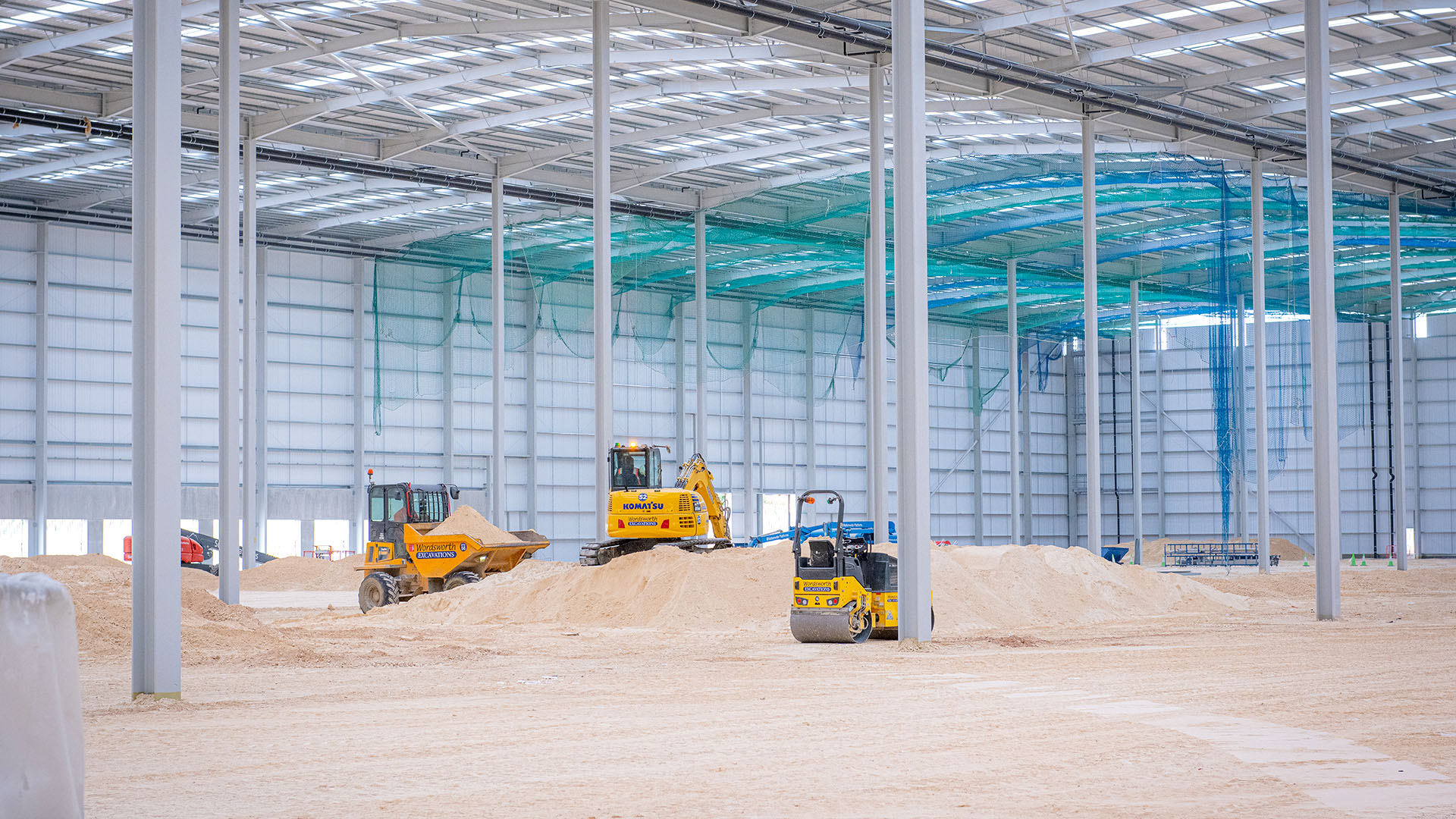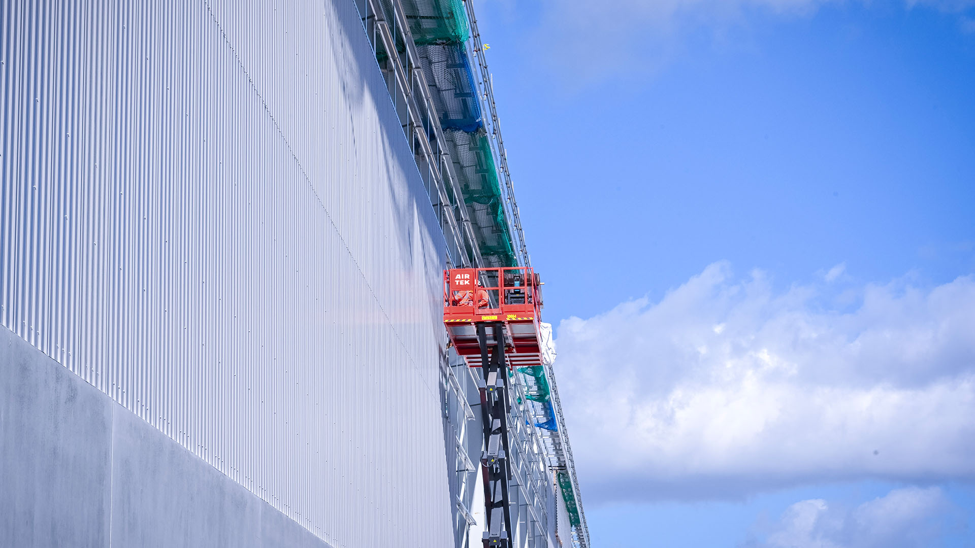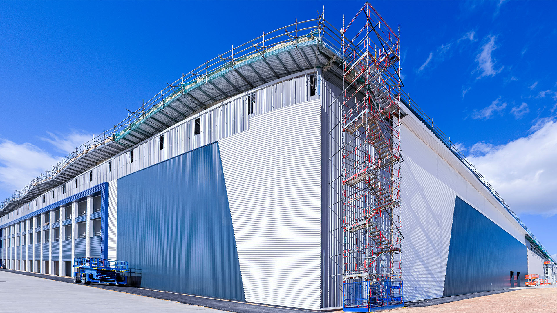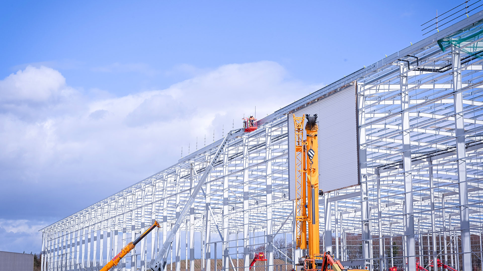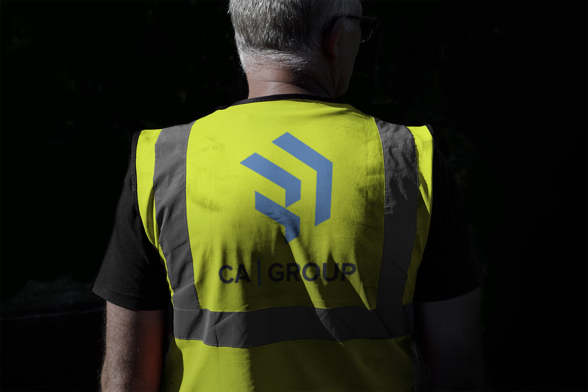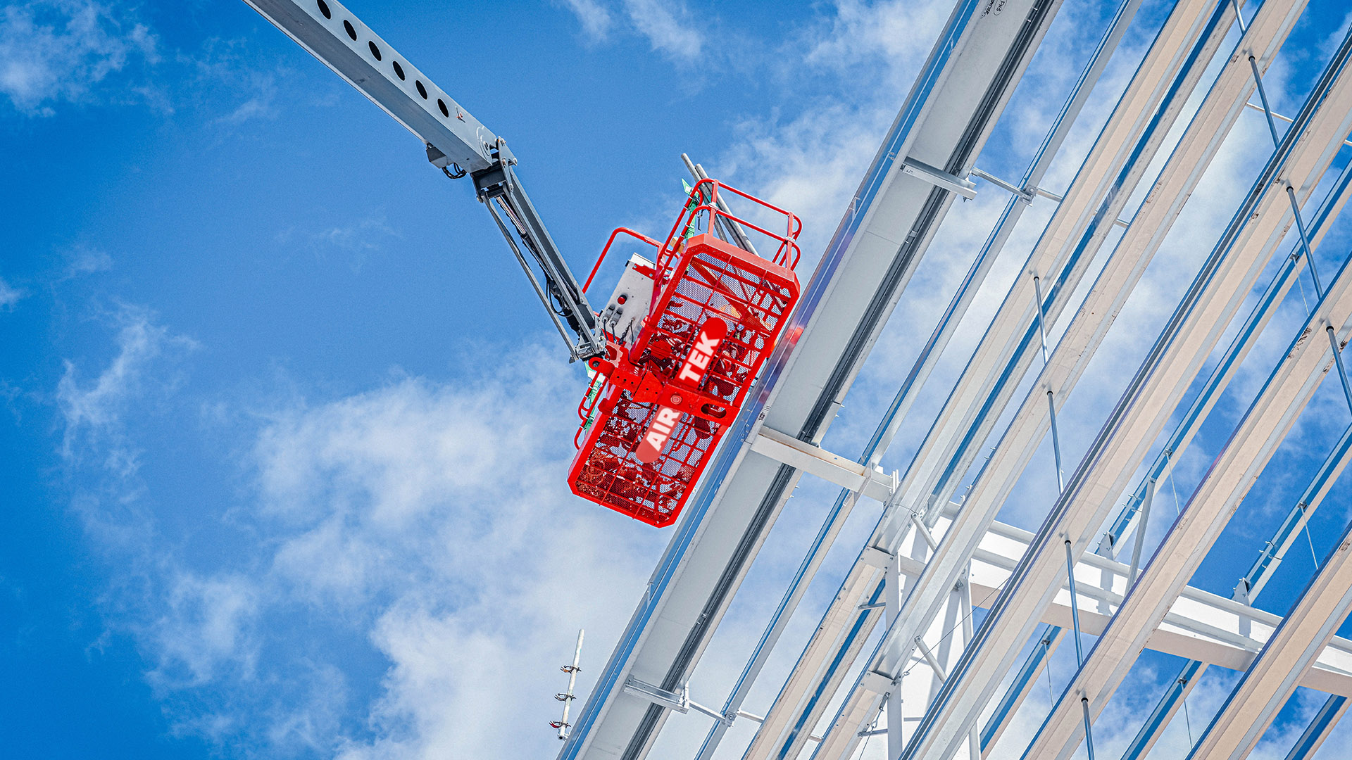
They approached us for a brand refresh that would better communicate their reliability, scale and technical expertise. Their work spans from safety netting and edge protection to lifeline systems, access towers and rope access which all play a critical role in keeping worksites secure and compliant.
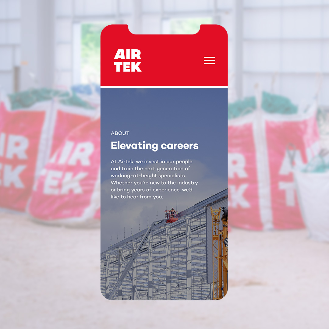
To reflect these values, we introduced a bold, heavy typeface that conveys strength and stability, paired with a modular grid system inspired by safety nets, scaffolding, and architectural frameworks. We then extended this refreshed identity across a newly designed and developed website, creating a seamless and professional online presence that reinforces Airtek’s reputation for precision and safety.